Typography and the Gutenberg Bible
Recently I've gotten more and more enamored with the intricacies of typography. That sentence had far too many big words in it. Let me start over.
Type is neat. I like type. Cause it's neat.
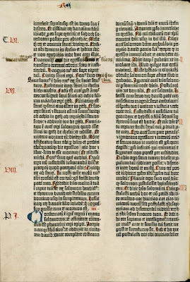
Much better. Below is a page from the Gutenberg Bible.
There's a number of fascinating pieces here.
Once is how close this is to the modern day Torah. It used to be that all texts were printed in the vein that I've always through reserved for the Torah. The columns are all about ten words across, with justification done not only through changing the spacing between letters and words, but also by changing parts of the letters themselves(something not done ever today outside of the Torah and other hand written texts).
There's far more elegance in this than anything coming out of computers today. Each letter starting off a new section is customized, as is each letter inside of that section. The mistakes are kept in, part of the beauty showing the process.
Of course this is all scratching the surface of type. For an in depth look at the world of type today check out I love typography and The Font Feed or for a real kick in the pants read The Elements of Typographic Style, a book that completely turned my design sensibilities on their head. If you don't know about @webfont you're falling behind the times.
